.png)

Visual design is used to create a pleasant viewing, reading and transaction experience.
The three factors that have most effect on the creation of a pleasant user and reading experience are hierarchy, the use of white space and typography. In visual design these deserve more attention than they usually receive.
That's why for this article, I've put together some information and hints about each of them. These are based both on my own experience as a visual designer and on a lot of research that I've studied during the course of my career. If you want to deepen your skills in this area, I've put together some links & sources that you'll find at the end of this article.
1) You can use hierarchy to enhance perception of an entity
Hierarchy means grouping visual elements so that the user can easily perceive the relationships between both the whole and its parts. It enables the user to quickly understand what issues are the most important for each job and which ones essentially belong together.
With a good hierarchy, the user is able to start the transaction process easily or quickly find their way more deeply into the data.
This effect is the result of the fact that people’s brains have a tendency to group things continually. We look for order in disorder. When you provide it by illustrating the priority order of issues, for example using empty space and font size, you remove an enormous amount of work for the brain. And that means an easier and more a pleasant transaction experience.
2) White space helps steer the gaze
Perhaps somewhat surprisingly, research has shown that white space is the most effective factor in directing people's gaze. The brain uses white space above all in interpreting the relationships between elements. A layout grouped clearly by using white space gives a calm reading and usage experience and makes it pleasant.
Using white space:
- Helps the brain to perceive the relations between elements and guides the flow of information.
- Helps the brain identify what elements belong together.
- Steers the gaze towards the most important elements for a given task and helps the user reach their goal without hindrance.
The picture below illustrates the differences between optimal and less-than-optimal use of white space. White space also creates a hierarchy between the elements that makes it easier to perceive the whole. Can you see that yourself?
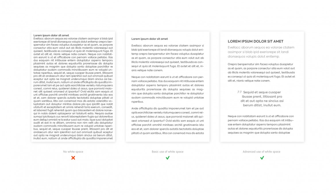
Above are three Gestalt views of which the middle one is most commonly seen in the web. However, it does not create the optimum reading experience, the same as on the far right, where all the extra work the brain needs to do to group things has been removed.
In good design the brain gets by with less. Energy is not used in structuring information, instead it can go directly to what is the most relevant.
3) Typography can be used to create feelings and make reading easier
Even good use of white space won’t save you if the typographic design is only half done and readability suffers. Studies have shown that typography is one of the most critical factors that affects the feeling experienced by the user and the ease of use.
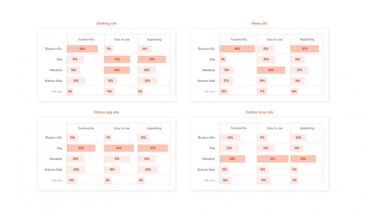
The picture above illustrates how the different fonts affect the experience of the transaction. For example, on a bank’s pages, the serif and traditional Baskerville font was seen to be more trustworthy, whereas on fitness pages the more modern, non-serif Fira was regarded as more trustworthy.
It is worth selecting the font according to the situation it will be used in, and not on the basis of your own preference or trends. The starting points for good typography, particularly online typography are:
- Select the font correctly for the use situation and the feeling wanted.
- Readability is the most important factor. X height.
- The rule of thumb is that in modern fonts this is already in place. Accept them.
- On a wider scale the fonts guarantee a clear reading experience online.
- Use left-aligned text, especially online. Fully justified text (text that is even on both left and right sides) makes the text hard to read, especially if it results in large and different sized gaps.
- Make sure the text line length is suitable from a readability perspective.
- Use a maximum of two different fonts.
- Use spacing carefully.
The right hand side layout of the picture series below has taken optimal note of all the lessons in this article: a good hierarchy, the use of white space and clear typography.
Three views of the same information – which of these do you find easiest to use and why? Hopefully you have found these tips useful and can apply them in your own work!
You can access further information from these sources:
How fonts influence users’ perception of your product, Alessio Laiso
The Aesthetics of Reading, Kevin Larson & Rosalind Picard
Written by
Tommi Leskinen